
Why Every Growing Business Needs an E-Commerce Website in 2025
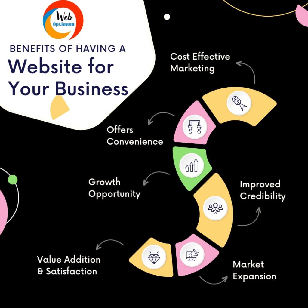
Why Every Growing Business Needs an E-Commerce Website in 2025 📦 From Local to Global: Time to Sell Beyond Your Shop If you’re a product-based business still depending only on walk-in customers, you’re missing a massive opportunity. In 2025, consumers expect to buy anytime, anywhere — and that’s exactly where an e-commerce website becomes your most powerful tool. At Web Optimum, we’ve helped dozens of businesses transform their traditional sales into online revenue machines — and now it’s your turn 🔍 Why You Need an E-Commerce Website (Right Now) 1. Your Customers Are Already Online More than 90% of Indian consumers now browse online before making a purchase. If you’re not visible there, you’re invisible to them. 2. 24×7 Sales – No Extra Manpower Unlike a physical shop, your website works even when you sleep. Orders can come in at midnight, from any city or country. 3. Build Your Brand – Not Just Sell Products With a well-designed website, you don’t just list products — you tell your brand story, showcase customer reviews, and build long-term trust. 🛒 Features That Web Optimum Adds to Your E-Commerce Website: ✅ Mobile-Friendly & Fast Loading✅ Secure Payment Gateways (Razorpay, Stripe, etc.)✅ Easy Product Management✅ WhatsApp Order Notifications✅ Discount & Coupon Management✅ SEO Setup to Rank on Google✅ Inventory Tracking✅ Abandoned Cart Recovery (optional) 🎯 Ready to Start Selling Online? Whether you’re a clothing brand, a handmade crafts seller, a furniture business, or a local FMCG store or even a Manufacturer — Web Optimum can help you go digital the right way. Let’s build a website that not only looks great but sells like crazy. 📞 Contact us now for a free consultation. 🌐 www.weboptimum.in
Why Every Growing Business Needs an E-Commerce Website in 2025 Read More »